Visualizations Portfolio
A selection of visualizations for reports made over the last few years.
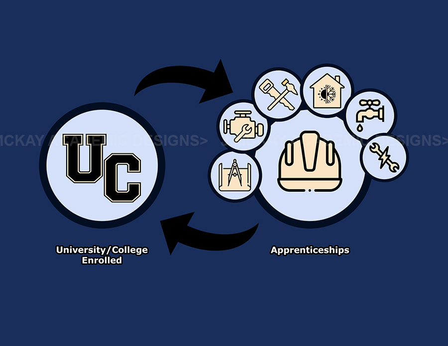
Post-secondary to Trades Visualization
This image was created for a 2022 report that looked at transfers from apprenticeships to post-secondary education and the reverse.
These visualisations are typically created as language-reduced tools to accompany a paper and/or live presentations, rather than as stand-alone infographics. They are client-specific and can contain as little embedded information as necessary.
What are "Visualizations"?: They are essentially a visual representation of verbal and data ideas. Infographics, illustrations, and data visualisations are all terms that could be used to describe a specific image here, but I prefer to use a broader term because the information frequently requires a more fluid process that isn't always easy to describe.
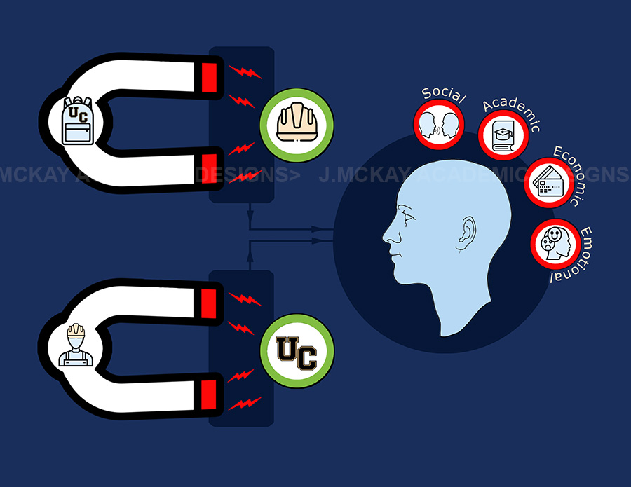
Post-secondary to Trades Visualization 2
Another image created for the aforementioned report. This one was designed to demonstrate students' attraction to trade, the inverse, and the dominant issues influencing their decisions.
Note on Titles: Some projects require an image with an embedded title. Some, such as this one, required the title to appear on the report header.
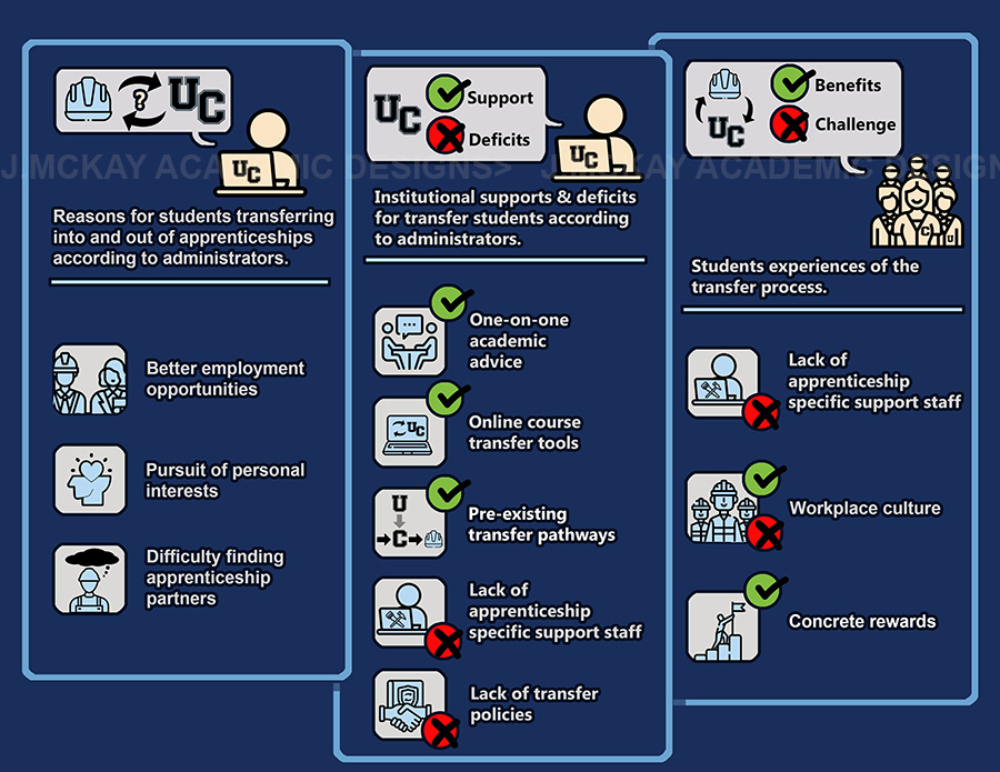
Post-secondary to Trades Visualization 3
This was the third image created for the transfer report mentioned above.
This one asked to use more words than the others, so it was more of a presentation than a simple list. I also tried to make something that people who learn best by seeing could understand as well as those who learn best by hearing. Again, though, this is not a stand-alone visual aid, even though it is close to the others. It is also meant to make you think of questions.
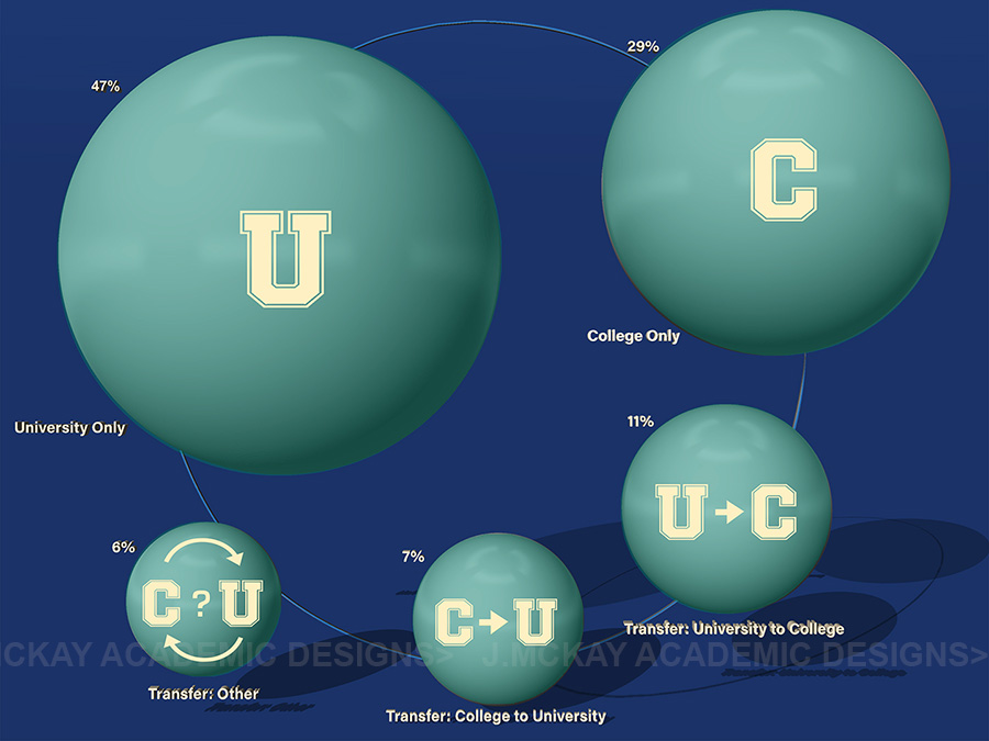
Report on post secondary transfers
For a report on Ontario students post secondary choices.
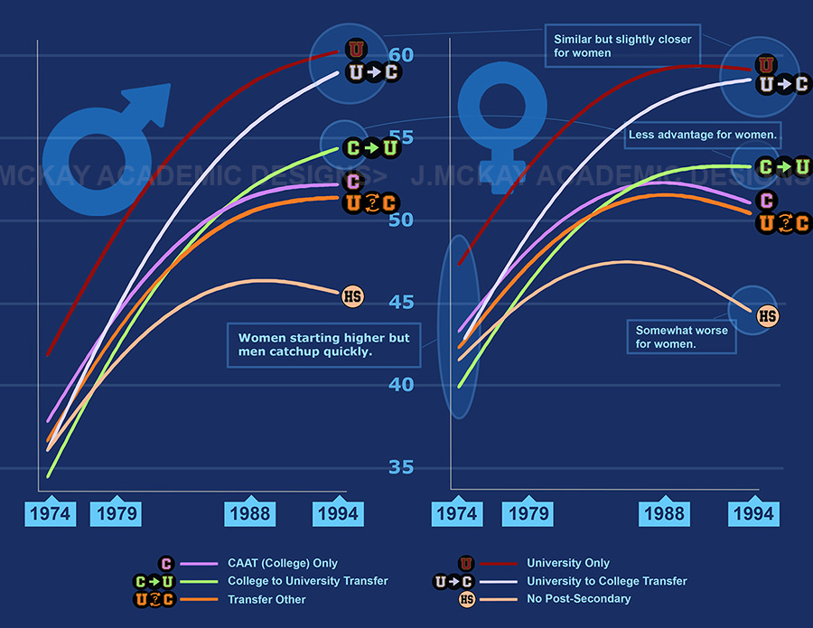
Report on Labour Market Outcomes 1
Commissioned for a report on student outcomes. This was a group that was studied over a 20 year span, their schooling, and their average annual incomes.
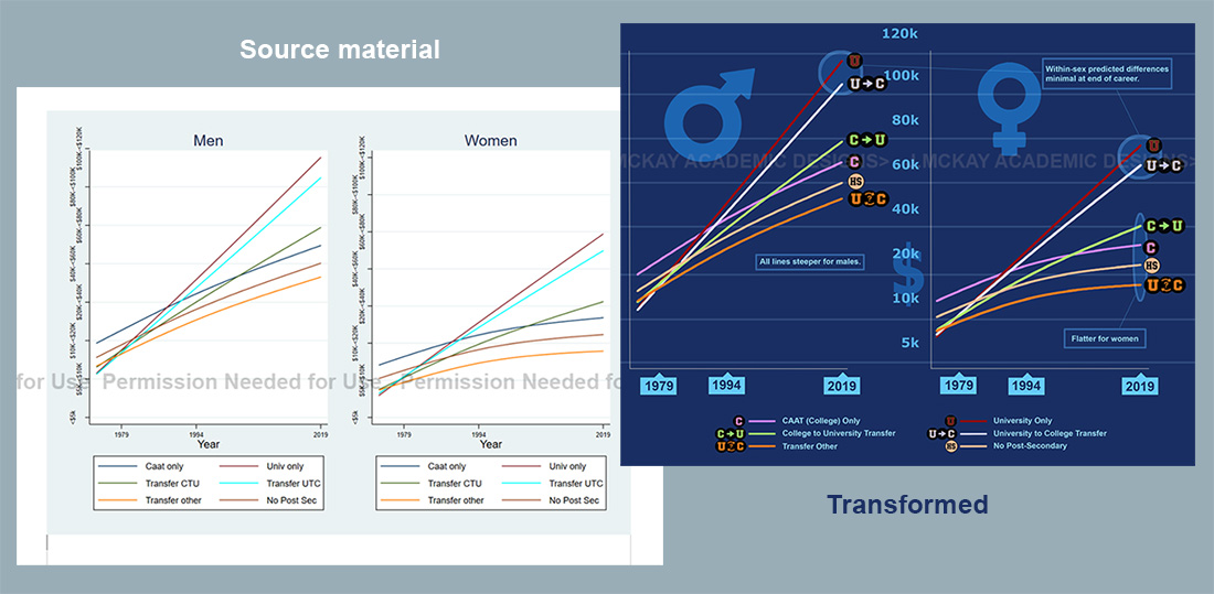
Report on Labour Market Outcomes 2
My client may occasionally provide me with existing visual source material from which I can work. Here's an example of how the transformation in this report occurred. In this case, the client requested that notes accompany the new image to aid in their presentation. In terms of communication, I believe that incorporating icons into the line graph made it easier for the viewer to make comparisons and digest the information with less effort.
Get a quote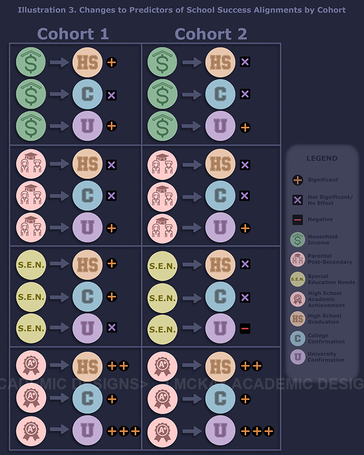
A Note on Icons
The icons I use are a mix of my own, 3rd party licensed icons, and a hybrid of the two.
Icons are obtained and licenced from websites like Flaticon. Depending on the third party, references may be required at the end of your report or paper.
Report on Labour Market Outcomes 3
It can be hard to cut back on words. As a clear representation of sex, it can be simple, but when it comes to concepts like "socioeconomic," I frequently need to build a different image in order to communicate the meaning. I frequently brainstorm several possibilities and then ask my clients for their input before moving forward.
This image was created to organise and convey noticeable differences in transfer student groups.
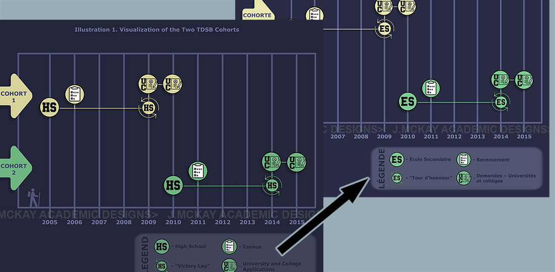
French Translation
The client in this case required a French translation of the report. The project was able to hire a third party to do the translations, allowing me to create the second version.
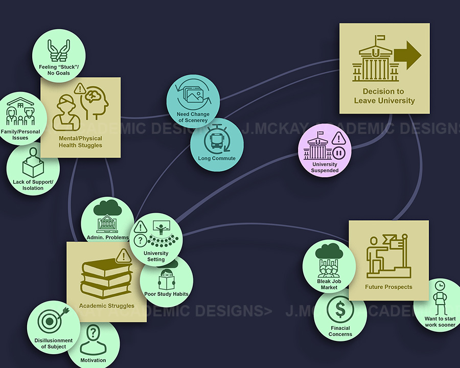
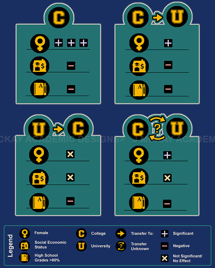
University to College Transfers 1
This image was created for the same report as previously mentioned. It depicts the various issues and paths that students take when deciding to leave university.
Note on Watermarks: Images for your project will not carry a watermark of course, they are intended only here to prevent theft of images and idea and to help protect mine and the associated project/commissioner of the said work.
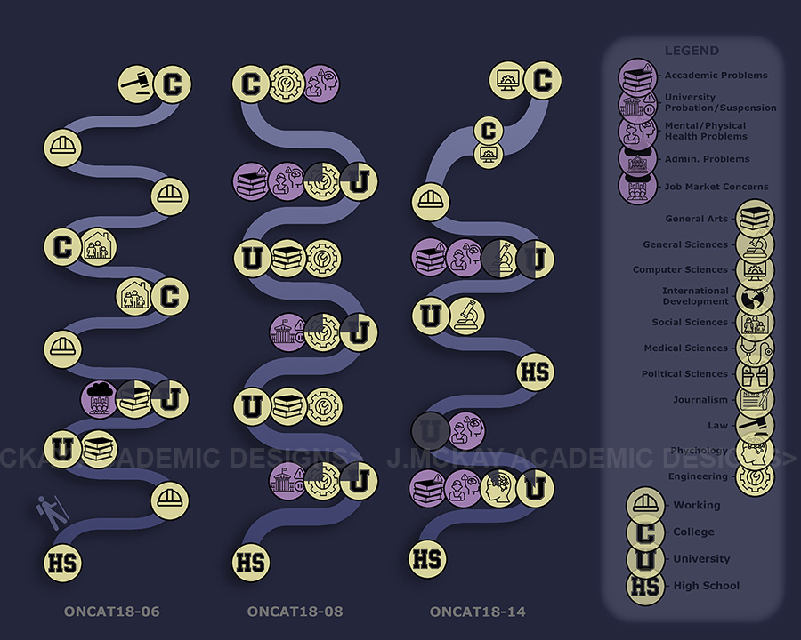
University to College Transfers 2(a)
This is from another project focused on student transfers. This depicts a sample of individual students' paths from high school (HS) to university (U) to college (C), as well as the focuses and issues they faced along the way. This was the first of two illustrations based on five different students.
Go to About page